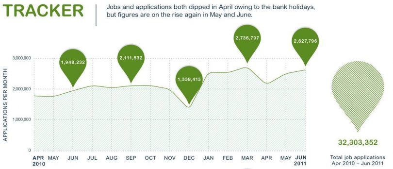
A very good infographic looking at statistics of Q2 2011, with respect to job advertised, applicants, and which regions in the UK have seen an increase/decrease in the number of advertised jobs.
Click to enlarge image.

totaljobsbarometer Infographic Powered by totaljobs.com

It was very interesting to read this piece of writing! Thank you so much!